Planning to choose typography for the next project
There are massive amounts of font available on the web. choosing the perfect font for your project is a difficult and confusing task for designers or non-designers. In this article, I will help you on how to choose the right font for your next project. And also share some practical tips and rules. before start this process there are few things to know about the font.
Font
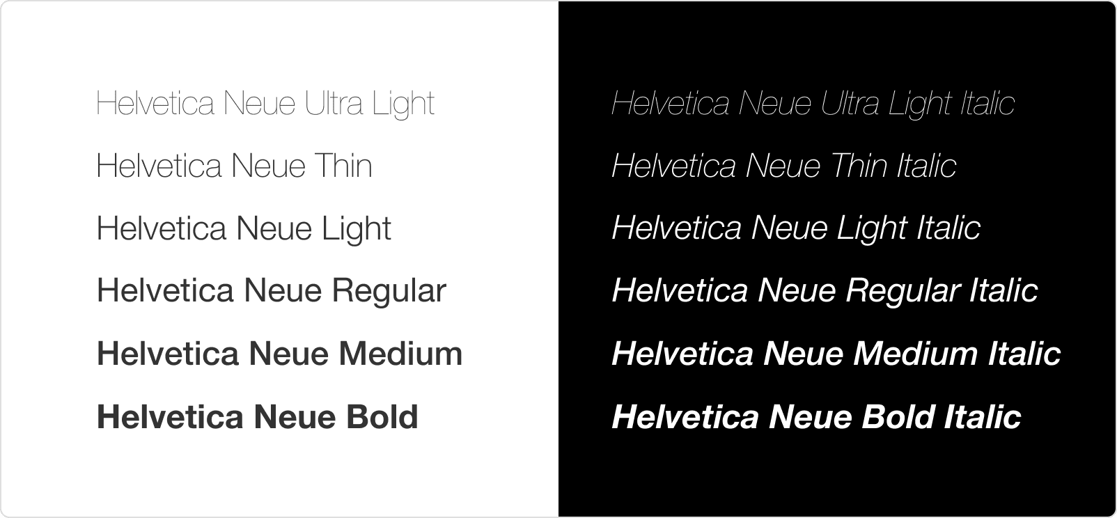
A font is nothing but a collection of different weights and styles. You will understand by looking at the following example.
Serif vs. Sans Serif Font
There are many different styles of fonts available on the web. But In these different styles, there are two common and widely use font styles is a serif and sans serif font style. But many beginners don't know the difference between these two font styles.
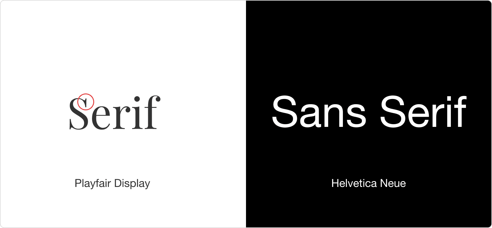
In this example, your confusion has been clarified what is a serif and sans serif style. On the left side, Serif style has a small decorative line attached at the end of each letter. On the right side, sans serif has no decorative line attached at the end of each letter. sans serif style has a simple clean end. both of these styles have their distinctive use.
These two things are enough to understand choosing the right font.
Choosing font
There are several free or paid fonts services options for font choosing. Here is some popular best option to find font:
Before picking the right font for your next project below important and useful tips to help you.
1. Use one or two font
In the above example, Using more than three or more fonts looking very ugly and unprofessional. For best practices, Use only one or two font sufficient for your project.
There are three benefits to choosing one or two font.
- Its simple to maintain.
- Increase the speed of your design.
- The performance of your font loading is too fast.
2. Readability
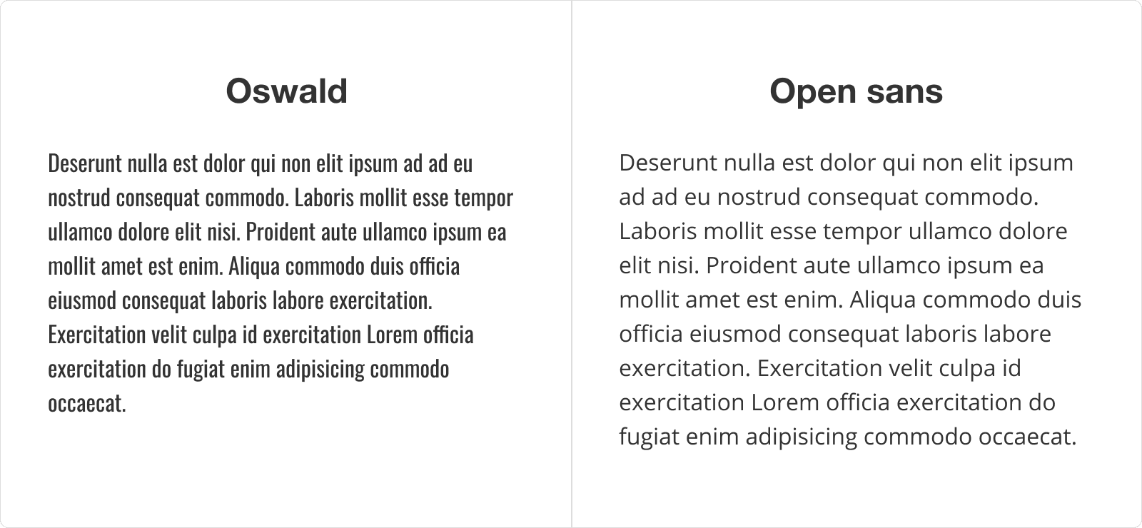
If the readability of your font is too hard, the reader skips your content. Readability one of the most important thing in web design. Some font makes for specific purposes. In the above example, the left side Oswald font is made for heading purpose. that's why content is too difficult to read. In right-side content, Open Sans font has some good amount of line-height. That's why open sans font can increase the reading better user experience. Whenever you choosing font always checks the readability of that font.
3. Contrast
Contrast is key to your font. Good contrast will make easy to scan what is heading and what is paragraph text. If you choose too-similar fonts, the contrast doesn't create. keep it mind avoid using two fonts of the same categories.
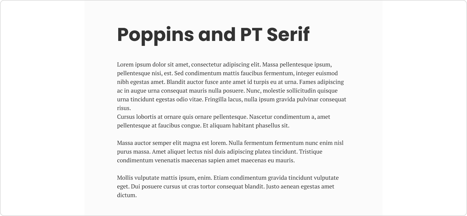
Many designers preferred, combine sans serif with a serif font. It is a perfect font pairing option. For best contrast, you should use sans serif font for the heading, and a serif font for the body text.
4. Legibility
Legibility is the main important factor in a well-designed font. The letter needs to be clear and recognizable that's means legibility. In many sans serif fonts, letters are identical. In the below example Nunito Sans font, capital I and lowercase i are identical. On another side Raleway font, capital I and lowercase i are different.
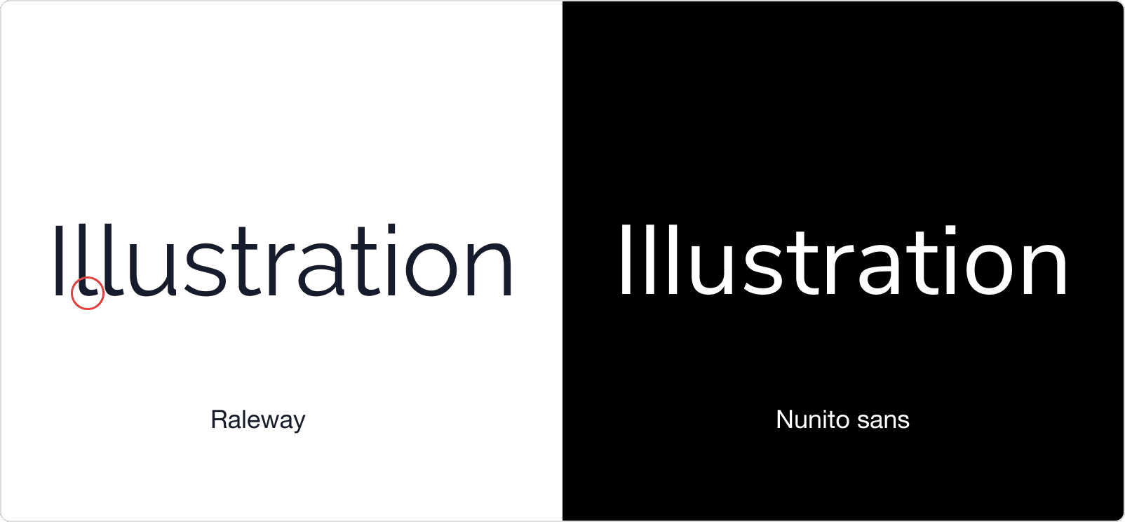
Raleway font has a clear letter than Nunito sans font. Whenever you choosing font especially sans serif font always checks the legibility of that font.
5. Use more than five weights
During choosing a web font the first thing to consider. does the font include more than five weights which mean (Light, Medium, Semi-bold, Bold, Black)
Here is one of the great example: Roboto, Open Sans, Proxima Nova .
6. Font pair
Many designers after choosing two font they still confusing whether it is font matching or not?
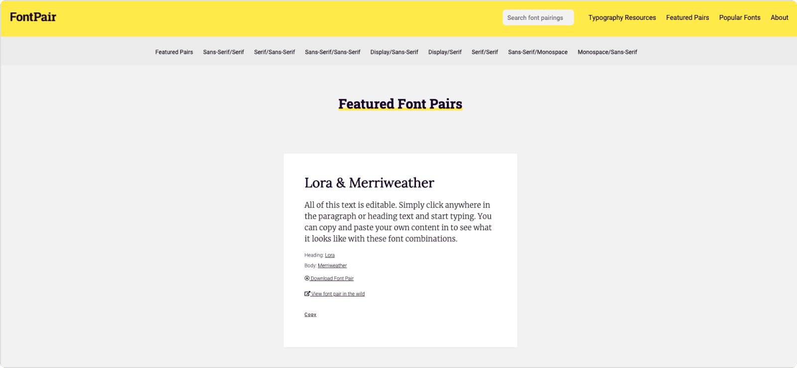
Here is the best tool for font pairing. fontpair.com
7. Font Popularity
If a font is popular, it’s almost a good font. most of the font services have sort by popularity filter.
Here are the 50 most popular fonts on the web. myfonts.com
If you want to check how much your font popular? How many sites use your font? What is it’s rank?
Here is the best site to check it out. fontreach.com
Here are the seven tips that you can use for your next project. Still more confusing about please let me know on twitter handle @sumitmwagh. I will definitely help you. In the next article, I will show you my recommended fonts, including headline fonts, paragraph fonts.